Thrasher
As the Lead Designer at Thrasher (Not the magazine - I wish!), I provided all brand design and art direction for the business - from tradeshow booths, murals, and video shoots, to the humblest day-to-day items like forms, direct mail, and signage.
Designing for the real world
When marketing asked the sales team to distribute door hangers in the neighborhoods they visited, there was pushback. To demonstrate that we were willing to do it ourselves, the marketing director asked each member of their team to distribute 100 door hangers themselves.
While doing this during an afternoon run, I discovered that doorknob design has evolved and that many were not suited to the conventional door hanger die cut design. I also observed that windy conditions can transform marketing tools into litter in the blink of an eye. With this new understanding I was able to customize the design to accommodate a wide variety of door knobs and weather conditions.
Above: When Thrasher built their meticulously designed and furnished new building, they recognized the disparity between the sleek, modern office spaces and the purely functional warehousing area. This sprawling mural was designed to help bridge the gap between the two sides of the building and the people who worked there.
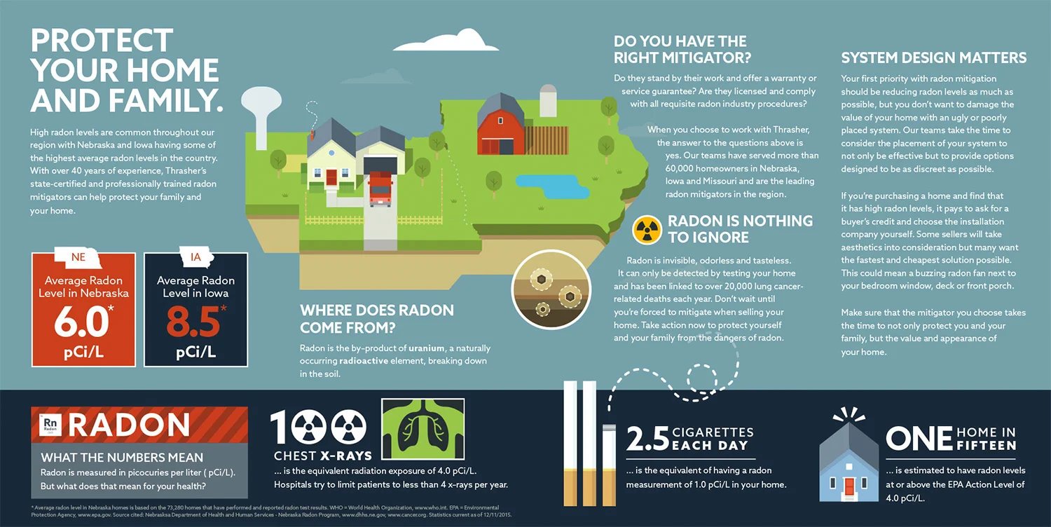
Above & Right: How do you tell a story about colorless, odorless gas? That was the challenge for this campaign on radon education. The goal was to make the material easy to consume, so simple design, bold colors, and compelling statistics were used to draw the audience in.


More than design
In the absence of a copywriting partner, I was tasked with scripting, designing, animating, and voicing this short explainer video on indoor air quality (IAQ). With more responsibilities than usual, and with a deadline to hit, I opted for a visually simple concept that would be easier to animate.
The result: The sales team shared that this video was a big hit with the homeowners they visited, owing to the upbeat and simple approach, in contrast to the dark, emotionally manipulative materials used by competitors in the region.
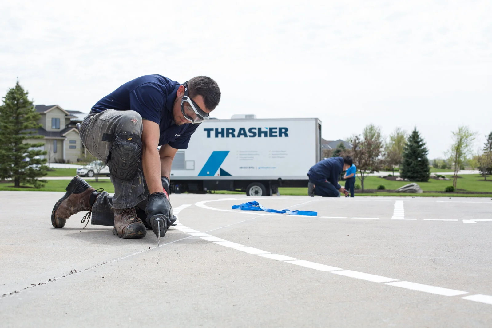
Above & Right: From rooftops in the rain, to sub-Sub-SUB basements, I’ve taken my camera into some challenging environments to capture dirty jobs and the gritty folks who do them.


A dash of video editing to better leverage our folks out in the field
With noteworthy work sites spread across an entire region, it was impractical to send out a videographer to meet the demand for all social content. Tapping into the sales and production teams on the ground, I provided training and resources for shooting short explainer videos, which I would then lightly polish with video editing and motion graphics into content.
The result: In a short amount of time, we were able to create a library of videos that the sales team could share with their customers, while also creating a perception of credibility and subject matter expertise among prospective customers.
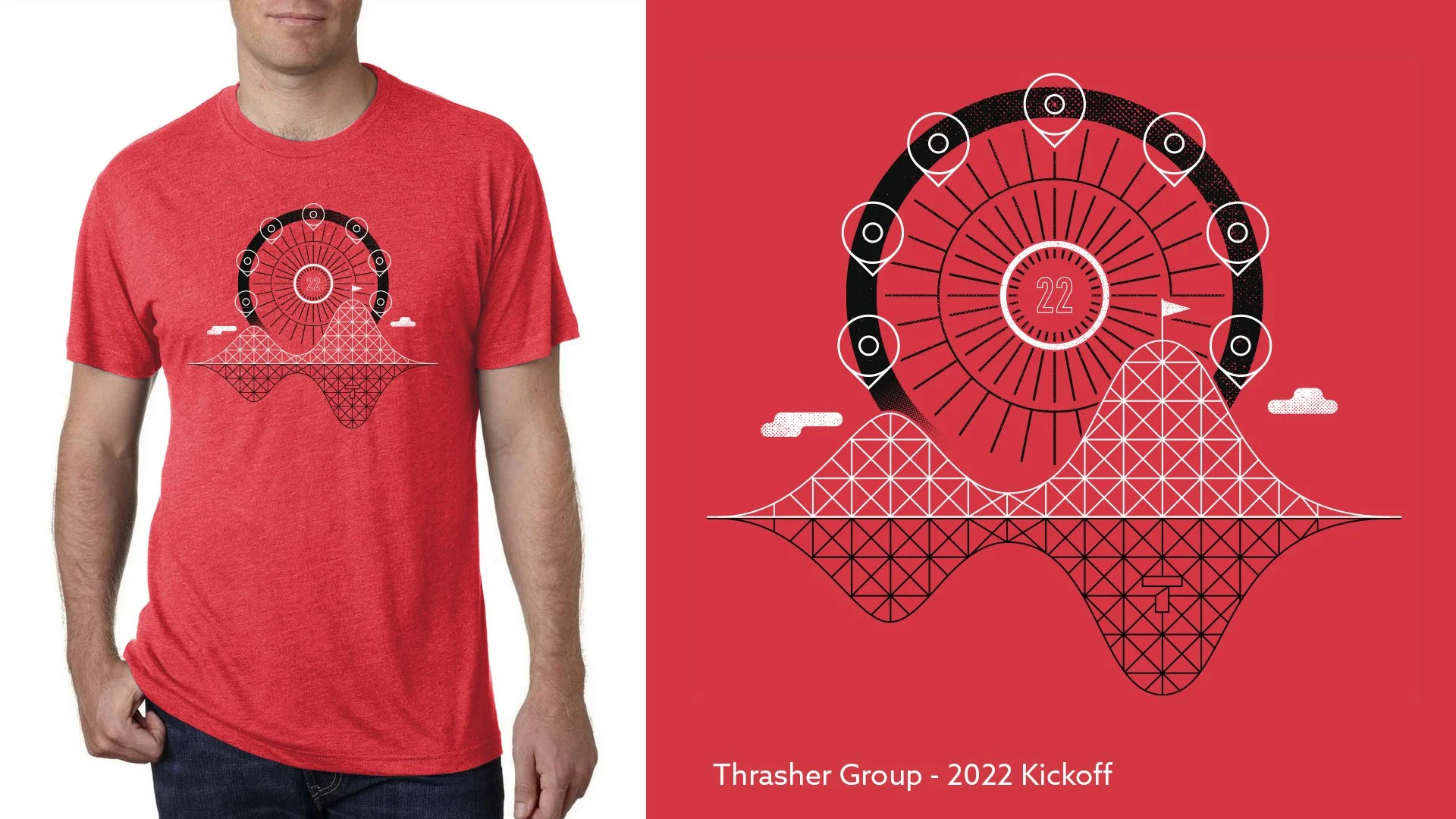
Above & Right: Milestones and events were memorialized with t-shirts, and the guage of a good t-shirt design was seeing how often it appeared around the office once the event was over.
Passing the baton
After many happy years working at Thrasher, it was time to move on. To help get word out to the local graphic design community that a design role at Thrasher was something worth a closer look, I created this short animated video for LinkedIn.
“Anthony is what I would call my “unicorn”. He understands the brand and business objectives to ensure that everything he works on is designed to tie back to a business goal. He has been integral in the company re-branding, and continues to take the brand to new levels. He is a great team player, passionate company advocate and a true leader.”


